


R语言绘图—绘制多组结果看趋势


最近碰到一个问题,需要绘制多个时间点的结果来了解看看总体趋势,而每个时间点有多个数据,那么如何在图中表现出来,今天就为大家来介绍一下,希望能帮到大家。
一、模拟数据
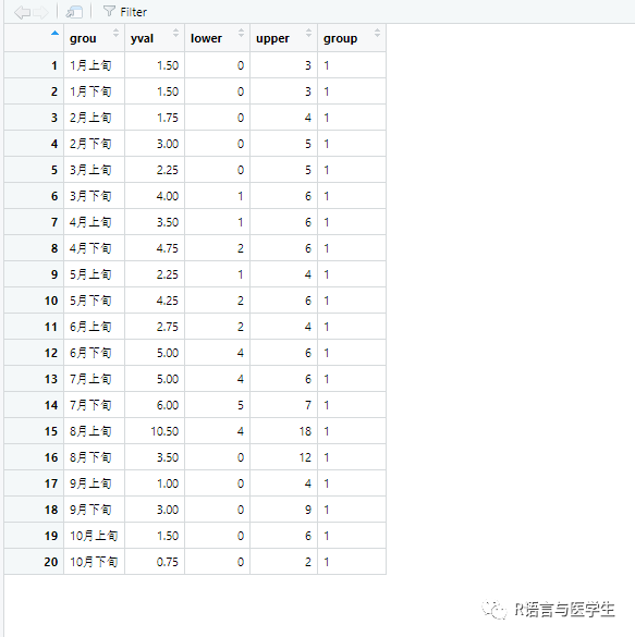
在模拟数据中,我这里是每个月的上下旬均有多个数据,这里我提前进行了处理,求出每个时间点的均值即yval,而lower和upper则是这组数据中的最大、最小值,group则是为了连线用,模拟数据如下:
myda<-data.frame(
 grou=factor(c("1月上旬","1月下旬","2月上旬","2月下旬","3月上旬","3月下旬",
                "4月上旬","4月下旬","5月上旬","5月下旬","6月上旬",'6月下旬',
                 '7月上旬','7月下旬',"8月上旬","8月下旬","9月上旬","9月下旬",
                '10月上旬',"10月下旬")),
              yval=c(1.5,1.5,1.75,3.0,2.25,4.0,3.5,4.75,2.25,4.25,2.75,
                     5.0,5.0,6.0,10.5,3.5,1,3,1.5,0.75),
             lower=c(0,0,0,0,0,1,1,2,1,2,2,4,4,5,4,0,0,0,0,0),
             upper=c(3,3,4,5,5,6,6,6,4,6,4,6,6,7,18,12,4,9,6,2),
group = factor(c(1,1,1,1,1,1,1,1,1,1)) ) 
需要注意的是我们要按时间点的顺序来排序,因此需要指定下顺序(系统默认按字母顺序来排序)。
 myda$grou<-factor(myda$grou,
                  levels =c("1月上旬","1月下旬","2月上旬","2月下旬","3月上旬","3月下旬",
                                       "4月上旬","4月下旬","5月上旬","5月下旬","6月上旬",'6月下旬',
                                      '7月上旬','7月下旬',"8月上旬","8月下旬","9月上旬","9月下旬",
                                       '10月上旬',"10月下旬"))
二、绘图
2.1绘制简单的图形
library(ggplot2)
library(hrbrthemes)
ggplot(data=myda,aes(x=grou,y=yval,color=grou))+
         geom_line(aes(group=group),size=1.5)+
          theme_ipsum()+
          ylab("BI指数")+
          xlab("时间")+
        ggtitle("R语言与医学生")+
        theme(legend.position = "none")
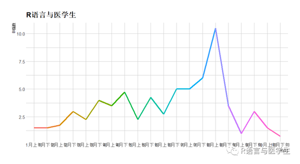
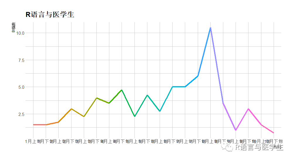
这里只展示了每个时间点的均值,这里我还想展示每个点的最大最小值;同时标签存在部分重叠,因此需要改进。
2.2绘制显示最大最小值的图
这里我们需要借助geom_errorbar函数来绘制(可见之前的推文有介绍)。
ggplot(data=myda,
       aes(x=grou,y=yval,color=grou))+
     geom_line(aes(group=group),size=1.5)+
       theme_ipsum()+  ylab("BI指数")+
       xlab("时间")+
       ggtitle("R语言与医学生")+
        geom_errorbar(aes(ymin = lower, ymax = upper), width = 0.2,size=1)+
        theme(legend.position = "none")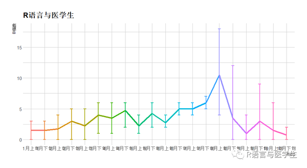
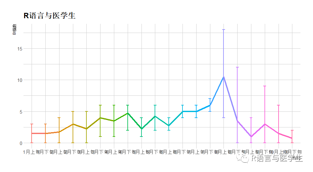
总体上我的目的达到了,但是需要对字体进行美化下,大家可以参照之前介绍的标题、图例、颜色等专题进行修改。
2.3 绘制最终修饰图
ggplot(data=myda,aes(x=grou,y=yval,color=grou))+
   geom_line(aes(group=group),size=1.5)+
   theme_ipsum()+
    ylab("BI指数")+
     xlab("时间")+
    ggtitle("R语言与医学生")+
     geom_errorbar(aes(ymin = lower, ymax = upper), width = 0.2,size=1)+
      theme(legend.position = "none")+
        theme(    legend.position = "none",
        #plot.title = element_text(hjust = 0.5,vjust = 1,colour = "black",size = 26),
          axis.text = element_text(size = 9, face = "bold"),
         axis.title = element_text(size = 11, face = "bold"),
         axis.title.y = element_text(angle = 0,size = 11, face = "bold"),
        axis.title.x = element_text(size = 11, face = "bold"),
        axis.text.x = element_text(angle = 45,hjust = 0.8,vjust = 0.9),