用 Python 中的 matplotlib 绘图时,如何根据样本点的 label 设置不同的颜色?
from sklearn.datasets import make_classification
X, y = make_classification(n_samples=500,
n_features=10,
n_classes=5,
n_informative=4,
random_state=0)
import matplotlib.pyplot as plt
plt.figure(figsize=(8, 8))
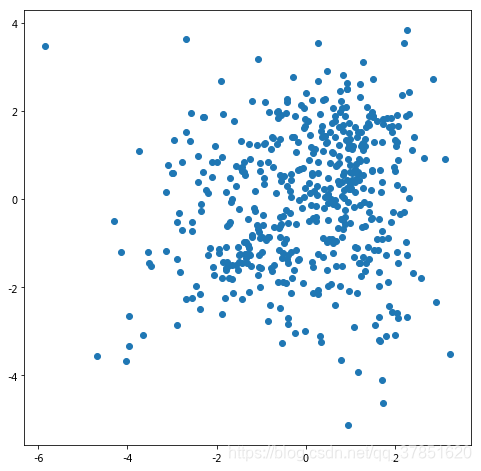
plt.scatter(X[:, 0], X[:, 1], marker='o')
默认绘图结果如下:
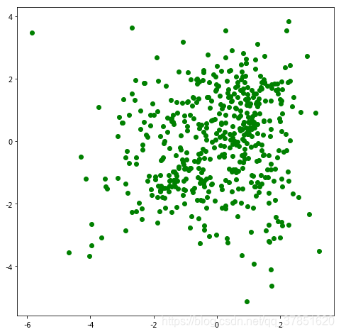
plt.figure(figsize=(8, 8))
plt.scatter(X[:, 0], X[:, 1], marker='o', c='g')
绘图结果如下:

(图片来源:
https://blog.csdn.net/qiu931110/article/details/68130199
)
参数
c
可以等于:
['c', 'b', 'g', 'r', 'm', 'y', 'k', 'w']
b
——blue
c
——cyan
g
——green
k
——black
m
——magenta
r
——red
w
——white
y
——yellow
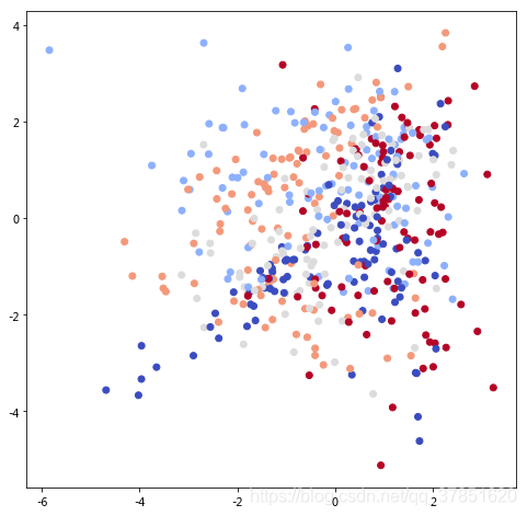
plt.figure(figsize=(8, 8))
plt.scatter(X[:, 0], X[:, 1], marker='o', c=y, cmap='coolwarm')
绘图结果如下:
cmap
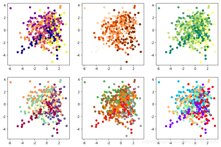
可以的取值可多了…演示一下:
plt.figure(figsize=(12, 8))
plt.subplot(231)
plt.scatter(X[:, 0], X[:, 1], marker='o', c=y, cmap='plasma')
plt.subplot(232)
plt.scatter(X[:, 0], X[:, 1], marker='o', c=y, cmap='Oranges')
plt.subplot(233)
plt.scatter(X[:, 0], X[:, 1], marker='o', c=y, cmap='summer')
plt.subplot(234)
plt.scatter(X[:, 0], X[:, 1], marker='o', c=y, cmap='Spectral')
plt.subplot(235)
plt.scatter(X[:, 0], X[:, 1], marker='o', c=y, cmap='Set1')
plt.subplot(236)
plt.scatter(X[:, 0], X[:, 1], marker='o', c=y, cmap='rainbow')
plt.show()
结果如下图:
colormap,也称color bar,matplotlib模块中内嵌了一大批常用的colormaps。请参阅官方文档
color example code: colormaps_reference.py
import numpy as np
import matplotlib.pyplot as plt
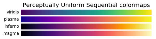
cmaps = [('Perceptually Uniform Sequential', [
'viridis', 'plasma', 'inferno', 'magma']),
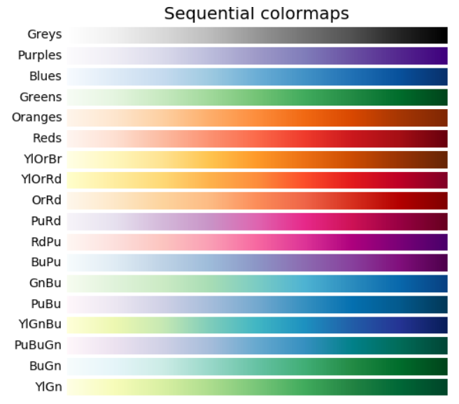
('Sequential', [
'Greys', 'Purples', 'Blues', 'Greens', 'Oranges', 'Reds',
'YlOrBr', 'YlOrRd', 'OrRd', 'PuRd', 'RdPu', 'BuPu',
'GnBu', 'PuBu', 'YlGnBu', 'PuBuGn', 'BuGn', 'YlGn']),
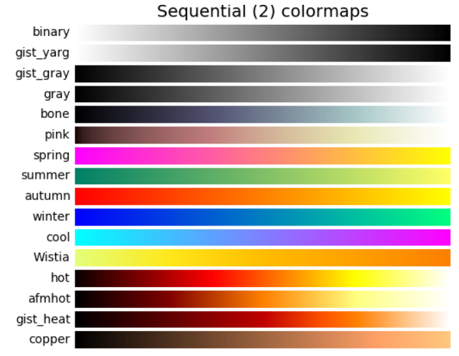
('Sequential (2)', [
'binary', 'gist_yarg', 'gist_gray', 'gray', 'bone', 'pink',
'spring', 'summer', 'autumn', 'winter', 'cool', 'Wistia',
'hot', 'afmhot', 'gist_heat', 'copper']),
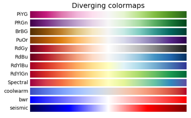
('Diverging', [
'PiYG', 'PRGn', 'BrBG', 'PuOr', 'RdGy', 'RdBu',
'RdYlBu', 'RdYlGn', 'Spectral', 'coolwarm', 'bwr', 'seismic']),
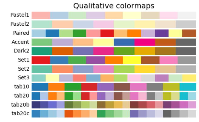
('Qualitative', [
'Pastel1', 'Pastel2', 'Paired', 'Accent',
'Dark2', 'Set1', 'Set2', 'Set3',
'tab10', 'tab20', 'tab20b', 'tab20c']),
('Miscellaneous', [
'flag', 'prism', 'ocean', 'gist_earth', 'terrain', 'gist_stern',
'gnuplot', 'gnuplot2', 'CMRmap', 'cubehelix', 'brg', 'hsv',
'gist_rainbow', 'rainbow', 'jet', 'nipy_spectral', 'gist_ncar'])]
nrows = max(len(cmap_list) for cmap_category, cmap_list in cmaps)
gradient = np.linspace(0, 1, 256)
gradient = np.vstack((gradient, gradient))
def plot_color_gradients(cmap_category, cmap_list, nrows):
fig, axes = plt.subplots(nrows=nrows)
fig.subplots_adjust(top=0.95, bottom=0.01, left=0.2, right=0.99)
axes[0].set_title(cmap_category + ' colormaps', fontsize=14)
for ax, name in zip(axes, cmap_list):
ax.imshow(gradient, aspect='auto', cmap=plt.get_cmap(name))
pos = list(ax.get_position().bounds)
x_text = pos[0] - 0.01
y_text = pos[1] + pos[3]/2.
fig.text(x_text, y_text, name, va='center', ha='right', fontsize=10)
for ax in axes:
ax.set_axis_off()
for cmap_category, cmap_list in cmaps:
plot_color_gradients(cmap_category, cmap_list, nrows)
plt.show()
‘Perceptually Uniform Sequential’:
‘Sequential’:
‘Sequential2’:
Diverging:
Qualitative:
Miscellaneous:
非常感谢:
【python图像处理】彩色映射
此外更多参考阅读:
颜色
属性:
方法1:
颜色
可以直接用
颜色
代码来表示,例如c='#00CED1'为青色,适合设定具体
颜色
的情况
import
matplotlib
.pyplot as
plt
x=[1,2,3,4,5]
plt
.
scatter
(x,y=x,color='#00CED1', s=100,marker='*')
plt
.show()
方法2:
颜色
可以由四个元素的元组组成,每个范围在[0,1]之间,例如
c=(0.1, 0.8, 0.3, 0.4)
import
matplotlib
.pyplot as
plt
scatter
(x, y, s=None, c=None, marker=None, c
map
=None, norm=None, vmin=None, vmax=None, alpha=None, linewidths=None, verts=None, edgecolors=None, hold=None, data=None, **kwargs)
matplotlib
.pyplot.scat...
‘^’ triangle_up marker
‘<’ triangle_left marker
‘>’ triangle_right marker
‘1’ tri_down marker
‘2’ tri_up marker
我们在
Python
中经常使用会用到
matplotlib
画图,有些曲线和点的形状、
颜色
信息长时间不用就忘了,整理一下便于查找。
安装
matplotlib
后可以查看官方说明(太长不贴出来了)
from
matplotlib
import pyplot as
plt
help(
plt
.plot)
常用
颜色
:
'b' 蓝色
'g' 绿色
'r' 红色
'c' 青色
'm' 品红
'y' 黄色
散点图
和折线图需要的数组非常相似,区别是折线图会将各数据点连接起来;而
散点图
则只是描绘各数据点,并不会将这些数据点连接起来。
调用
Matplotlib
的
scatter
()函数来
绘制
散点图
,该函数支持如下常用参数:
x:指定 X 轴数据。
y:指定 Y 轴数据。
s:指定散点的大小。
c:指定散点的
颜色
。
alpha:指定散点的透明度。
linewidths:指定散点边框线的宽...
# Have color
map
s separated into categories:
# http://
matplotlib
.org/examples/color/color
map
s_reference.html
c
map
s = [('Perceptually Uniform Sequen...
'aliceblue': '#F0F8FF',
'antiquewhite': '#FAEBD7',
'aqua': '#00FFFF',
'aquamarine': '#7FFFD4',
'azure': '#F0FFFF',
'beige': '#F5F5DC',
'bisque': '#FFE4C4',

