示例一:
Xaml代码:
<Window x:Class="WPF0315a.MainWindow"
xmlns="http://schemas.microsoft.com/winfx/2006/xaml/presentation"
xmlns:x="http://schemas.microsoft.com/winfx/2006/xaml"
xmlns:local="clr-namespace:WPF0315a"
Title="MainWindow" Height="350" Width="525">
<Window.Resources>
<local:SizeConverter x:Key="MyConverter"></local:SizeConverter>
<Style TargetType="ToggleButton" x:Key="DefaultButton">
<Setter Property="Template">
<Setter.Value>
<ControlTemplate TargetType="ToggleButton">
<Rectangle Name="ButtonRectangle" Width="{TemplateBinding Width}"
Height="{TemplateBinding Height,Converter={StaticResource MyConverter}}"
Fill="{TemplateBinding Background}"
RadiusX="{Binding Path=Height,Converter={StaticResource MyConverter}, RelativeSource={RelativeSource Self}}"
RadiusY="{Binding Path=RadiusX,RelativeSource={RelativeSource Self}}">
</Rectangle>
<Ellipse Name="ButtonEllipse" Height="{TemplateBinding Height}"
Width="{Binding RelativeSource={RelativeSource Self}, Path=Height}"
Fill="White" Stroke="Gray"></Ellipse>
</Grid>
<ControlTemplate.Triggers>
<Trigger Property="IsChecked" Value="true">
<Setter TargetName="ButtonEllipse" Property="HorizontalAlignment" Value="Right"></Setter>
</Trigger>
<Trigger Property="IsChecked" Value="false">
<Setter Property="Fill" TargetName="ButtonRectangle" Value="Gray"></Setter>
<Setter TargetName="ButtonEllipse" Property="HorizontalAlignment" Value="Left"></Setter>
</Trigger>
</ControlTemplate.Triggers>
</ControlTemplate>
</Setter.Value>
</Setter>
<Setter Property="Background" Value="DarkSeaGreen"></Setter>
</Style>
</Window.Resources>
<ToggleButton Width="120" Height="70" Content="GOOD" Style="{StaticResource DefaultButton}"></ToggleButton>
</Grid>
</Window>
添加一个转换器类的代码:
using System;
using System.Collections.Generic;
using System.Linq;
using System.Text;
using System.Threading.Tasks;
namespace WPF0315a
class SizeConverter:System.Windows.Data.IValueConverter
public object Convert(object value, Type targetType, object parameter, System.Globalization.CultureInfo culture)
return (double)value / 2;
public object ConvertBack(object value, Type targetType, object parameter, System.Globalization.CultureInfo culture)
return null;
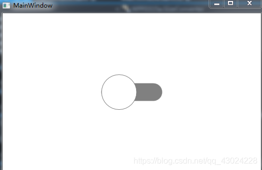
运行效果:
示例二:
添加一个自定义控件FlatToggleButton,Generic.xaml代码:
<ResourceDictionary
xmlns="http://schemas.microsoft.com/winfx/2006/xaml/presentation"
xmlns:x="http://schemas.microsoft.com/winfx/2006/xaml"
xmlns:local="clr-namespace:WPF0316b">
<SolidColorBrush x:Key="Button.Static.Background" Color="#FFDBB377" />
<SolidColorBrush x:Key="Button.Static.Border" Color="#FF707070" />
<SolidColorBrush x:Key="Button.MouseOver.Background" Color="#FFBEE6FD" />
<SolidColorBrush x:Key="Button.MouseOver.Border" Color="#FF3C7FB1" />
<SolidColorBrush x:Key="Button.Pressed.Background" Color="#FFC4E5F6" />
<SolidColorBrush x:Key="Button.Pressed.Border" Color="#FF2C628B" />
<SolidColorBrush x:Key="Button.Disabled.Background" Color="#FFF4F4F4" />
<SolidColorBrush x:Key="Button.Disabled.Border" Color="#FFADB2B5" />
<SolidColorBrush x:Key="Button.Disabled.Foreground" Color="#FF838383" />
<SolidColorBrush x:Key="Button.Checked.Foreground" Color="#FF76E8A6" />
<Style TargetType="{x:Type local:FlatToggleButton}">
<Setter Property="FocusVisualStyle" Value="{x:Null}" />
<Setter Property="Background"
Value="{StaticResource Button.Pressed.Background}" />
<Setter Property="BorderBrush" Value="{StaticResource Button.Static.Border}" />
<Setter Property="Foreground" Value="{DynamicResource {x:Static SystemColors.ControlTextBrushKey}}" />
<Setter Property="BorderThickness" Value="0" />
<Setter Property="HorizontalContentAlignment" Value="Center" />
<Setter Property="VerticalContentAlignment" Value="Center" />
<Setter Property="Padding" Value="0" />
<Setter Property="Width" Value="43" />
<Setter Property="Height" Value="20" />
<Setter Property="Template">
<Setter.Value>
<ControlTemplate TargetType="{x:Type local:FlatToggleButton}">
<Border x:Name="border"
Background="{StaticResource Button.Pressed.Background}"
BorderBrush="{TemplateBinding BorderBrush}"
BorderThickness="{TemplateBinding BorderThickness}"
CornerRadius="10" SnapsToDevicePixels="true" UseLayoutRounding="True" />
<Border x:Name="InnerBd" Width="15" Height="15" Margin="3,0"
HorizontalAlignment="Left" VerticalAlignment="Center" Background="White" CornerRadius="100"
RenderTransformOrigin="0.5,0.5">
<Border.RenderTransform>
<TransformGroup>
<ScaleTransform />
<SkewTransform />
<RotateTransform />
<TranslateTransform />
</TransformGroup>
</Border.RenderTransform>
</Border>
<VisualStateManager.VisualStateGroups>
<VisualStateGroup x:Name="CheckStates">
<VisualState x:Name="Checked">
<Storyboard>
<DoubleAnimationUsingKeyFrames Storyboard.TargetName="InnerBd" Storyboard.TargetProperty="(UIElement.RenderTransform).(TransformGroup.Children)[3].(TranslateTransform.X)">
<EasingDoubleKeyFrame KeyTime="0" Value="0">
<EasingDoubleKeyFrame.EasingFunction>
<CubicEase EasingMode="EaseOut" />
</EasingDoubleKeyFrame.EasingFunction>
</EasingDoubleKeyFrame>
<EasingDoubleKeyFrame KeyTime="0:0:0.2" Value="22">
<EasingDoubleKeyFrame.EasingFunction>
<CubicEase EasingMode="EaseOut" />
</EasingDoubleKeyFrame.EasingFunction>
</EasingDoubleKeyFrame>
</DoubleAnimationUsingKeyFrames>
<ColorAnimationUsingKeyFrames BeginTime="00:00:00" Storyboard.TargetName="border" Storyboard.TargetProperty="(Border.Background).(SolidColorBrush.Color)">
<EasingColorKeyFrame KeyTime="0:0:0" Value="#FFC4E5F6">
<EasingColorKeyFrame.EasingFunction>
<CircleEase EasingMode="EaseOut" />
</EasingColorKeyFrame.EasingFunction>
</EasingColorKeyFrame>
<EasingColorKeyFrame KeyTime="0:0:0.2" Value="#FF3399FF">
<EasingColorKeyFrame.EasingFunction>
<CircleEase EasingMode="EaseOut" />
</EasingColorKeyFrame.EasingFunction>
</EasingColorKeyFrame>
</ColorAnimationUsingKeyFrames>
</Storyboard>
</VisualState>
<VisualState x:Name="Unchecked">
<Storyboard>
<DoubleAnimationUsingKeyFrames Storyboard.TargetName="InnerBd" Storyboard.TargetProperty="(UIElement.RenderTransform).(TransformGroup.Children)[3].(TranslateTransform.X)">
<EasingDoubleKeyFrame KeyTime="0" Value="22">
<EasingDoubleKeyFrame.EasingFunction>
<CubicEase EasingMode="EaseIn" />
</EasingDoubleKeyFrame.EasingFunction>
</EasingDoubleKeyFrame>
<EasingDoubleKeyFrame KeyTime="0:0:0.2" Value="0">
<EasingDoubleKeyFrame.EasingFunction>
<CubicEase EasingMode="EaseIn" />
</EasingDoubleKeyFrame.EasingFunction>
</EasingDoubleKeyFrame>
</DoubleAnimationUsingKeyFrames>
<ColorAnimation BeginTime="00:00:00" Duration="0:0:0.2" From="#FF3399FF"
Storyboard.TargetName="border"
Storyboard.TargetProperty="(Border.Background).(SolidColorBrush.Color)"
To="#FFC4E5F6" />
</Storyboard>
</VisualState>
</VisualStateGroup>
</VisualStateManager.VisualStateGroups>
</Grid>
</ControlTemplate>
</Setter.Value>
</Setter>
</Style>
</ResourceDictionary>
FlatToggleButton.cs代码:
using System;
using System.Collections.Generic;
using System.Linq;
using System.Text;
using System.Threading.Tasks;
using System.Windows;
using System.Windows.Controls;
using System.Windows.Controls.Primitives;
using System.Windows.Data;
using System.Windows.Documents;
using System.Windows.Input;
using System.Windows.Media;
using System.Windows.Media.Imaging;
using System.Windows.Navigation;
using System.Windows.Shapes;
namespace WPF0316b
public class FlatToggleButton : ToggleButton
static FlatToggleButton()
DefaultStyleKeyProperty.OverrideMetadata(typeof(FlatToggleButton), new FrameworkPropertyMetadata(typeof(FlatToggleButton)));
主窗体代码:
<Window x:Class="WPF0316b.MainWindow"
xmlns="http://schemas.microsoft.com/winfx/2006/xaml/presentation"
xmlns:x="http://schemas.microsoft.com/winfx/2006/xaml"
xmlns:d="http://schemas.microsoft.com/expression/blend/2008"
xmlns:mc="http://schemas.openxmlformats.org/markup-compatibility/2006"
xmlns:local="clr-namespace:WPF0316b"
mc:Ignorable="d"
Title="MainWindow" Height="450" Width="800">
<local:FlatToggleButton Width="43" Height="20" HorizontalAlignment="Center" VerticalAlignment="Center" IsChecked="True"/>
</Grid>
</Window>
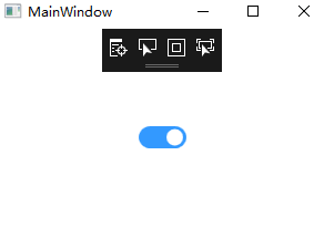
运行效果图:
WPF 实现切换按钮Xaml代码:<Window x:Class="WPF0315a.MainWindow" xmlns="http://schemas.microsoft.com/winfx/2006/xaml/presentation" xmlns:x="http://schemas.microsoft.com/winfx/2006/xaml" ...
<Window x:Class="HtmlToXamlDemo.MainWindow"
xmlns="http://schemas.microsoft.com/winfx/2006/xaml/presentation"
xmlns:x="http://schemas.microsoft.com/winfx/2006/xaml"
xmlns:d="http://schemas.microsoft.com/express
源码下载地址https://download.csdn.net/download/shizu11zz/24417299https://download.csdn.net/download/shizu11zz/24417299
直接贴源码,有帮助的话求点个赞,不过分吧:
【MainWindow.Xaml】
<Window
xmlns="http://schemas.microsoft.com/winfx/2006/xaml/presentation"
没有Button控件的界面框架是不完整的。所以,WPF当然也有自己的按钮控件。就像WPF其它的控件一样,按钮控件的使用非常灵活,几乎可以让你实现任何东西。就让我们从以下几个简单例子开始吧:
简单的按钮
像其他的WPF控件一样,您可以用Button标记定义按钮控件。如果你在标记定义中间加入文字,文字的内容就是按钮的文字内容。
<Button>Hello, world!</Button>
很简单吧?当然,上面这个例子里的按钮并没有任何实际的逻辑在里面。不过,如果你把鼠标移上
WPF多个按钮点击切换样式
本文主要讲述WPF中多个按钮,点击状态为一个样式,未点击状态为一个样式,两种样式通过点击这个动作会发生改变,点击另一个按钮,当前已点击的按钮样式也改变的情况。
不复杂样式的多个按钮
主要做法就是将按钮使用radiobutton来代替,然后各个radiobutton的GroupName取名为同一个,如本例中就是取名为“button1”。
&lt;RadioButton ...
在上一篇文章 深入了解 WPF Dispatcher 的工作原理(Invoke/InvokeAsync 部分) 中我们发现 Dispatcher.Invoke 方法内部是靠 Dispatcher.PushFrame 来确保“不阻塞地等待”的。然而它是怎么做到“不阻塞地等待”的呢?
阅读本文将更深入地了解 Dispatcher 的工作机制。...
CollapseRowGroup:闭合DataGrid的行分组。
CommitEdit:确认DataGrid的编辑完成。
ExpandRowGroup:展开DataGrid的行分组。
GetGroupFromItem:从具体Item中得到分组。
ScrollI...
您好!要在WPF中实现按钮的材质切换,您可以使用以下步骤:
1. 首先,确保您已经添加了Material Design的相关资源到您的项目中您可以通过NuGet包管理器安装MaterialDesignThemes和MaterialDesignColors。
2. 在XAML中,将按钮的样式设置为Material Design的样式。例如:
```xaml
<Button Style="{StaticResource MaterialDesignRaisedButton}" Content="切换按钮" />
3. 现在,我们需要为按钮的不同状态创建样式。您可以使用VisualStateManager来定义这些样式。例如,您可以为按钮的正常状态和按下状态创建两个样式:
```xaml
<Button Style="{StaticResource MaterialDesignRaisedButton}">
<VisualStateManager.VisualStateGroups>
<VisualStateGroup>
<VisualState x:Name="Normal">
<Storyboard>
<ColorAnimation Storyboard.TargetProperty="(Button.Background).(SolidColorBrush.Color)"
To="Green" Duration="0:0:0.2" />
</Storyboard>
</VisualState>
<VisualState x:Name="Pressed">
<Storyboard>
<ColorAnimation Storyboard.TargetProperty="(Button.Background).(SolidColorBrush.Color)"
To="Red" Duration="0:0:0.2" />
</Storyboard>
</VisualState>
</VisualStateGroup>
</VisualStateManager.VisualStateGroups>
切换按钮
</Button>
在上述示例中,我们为正常状态定义了一个颜色动画,将按钮背景色设置为绿色。当按钮按下时,我们为按下状态定义了另一个颜色动画,将按钮背景色设置为红色。
通过使用VisualStateManager,您可以根据按钮的不同状态来定义不同的样式,以实现材质切换的效果。
希望能对您有所帮助!如果您有任何其他问题,请随时提问。

