学习过程中将笔记跟大家分享,希望对大家也有所帮助,共同成长进步💪~\
如果大家喜欢,可以点赞或留言💕
~~,谢谢大家⭐️⭐️⭐️
~
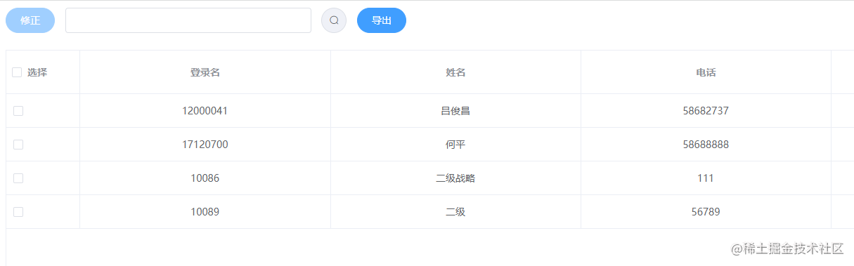
效果图一:
将表格多选表头全选框替换成文字效果

表格部分
首先我们把全选框换成自己想要的文字:这里有使用
header-cell-class-name
属性给表头添加自定义class
header-cell-class-name:
类型:Function({row, column, rowIndex, columnIndex})/String
说明:表头单元格的 className 的回调方法,也可以使用字符串为所有表头单元格设置一个固定的 className。
<el-table :data="tableData" border height="784" ref="Table" :header-cell-class-name="cellClass" @selection-change="handleSelectionChange" v-loading="loading">
    <el-table-column type="selection" width="55"></el-table-column>
    <el-table-column v-for="item in tabColumn" :key="item.index" :prop="item.prop" :label="item.label" :width="item.width" align="center" show-overflow-tooltip></el-table-column>
</el-table>
data数据
tableData: [
        login_name:"12000041",
        name:"吕俊昌",
        tele:"58682737",
        mobile:"13717732586",
        email:"aaaaa.lv@chnenergy.com.cn",
        login_name:"12000041",
        name:"吕俊昌",
        tele:"58682737",
        mobile:"13717732586",
        email:"aaaaa.lv@chnenergy.com.cn",
tabColumn:[
    { prop: "login_name", label: "登录名", width:""},
    { prop: "name", label: "姓名", width:""},
    { prop: "tele", label: "电话", width:""},
    { prop: "mobile", label: "手机", width:""},
    { prop: "email", label: "邮箱",width:""},
],
在methods里增加的方法
handleSelectionChange()是对额外单选情况的处理,例如效果图一使用;效果图二带全选+文字则就不需要处理不需要使用handleSelectionChange()函数
// 设置表头的class
cellClass(row){
    if (row.columnIndex === 0) {
        return 'disabledCheck'
handleSelectionChange(val) {
    if (val.length > 1) {
        let del_row = val.shift();
        this.$refs.Table.toggleRowSelection(del_row, false);
    this.multipleSelection = JSON.parse(JSON.stringify(val));
},
css样式
/* 去掉全选按钮 */
.el-table .disabledCheck .cell .el-checkbox__inner{
    display: none !important;
.el-table .disabledCheck .cell::before{
    content: '选择';
    text-align: center;
    line-height: 37px;
}
效果图二:
将表格多选表头替换成文字+全选框效果
css样式
样式可以根据自己展示微调哦
/* 去掉全选按钮 */
.el-table .disabledCheck .cell .el-checkbox__inner{
    /* display: none !important;  */
    margin-left: -50px;
.el-table .disabledCheck .cell::before{
    content: '选择';
    text-align: center;
    line-height: 37px;
    margin-left: 20px;
}
感谢大家阅读⭐️⭐️⭐️,如果喜欢,可以点赞或留言哟💕💕💕