sql azure 语法
In this article, we will explore charts in an Azure Data Studio using data stored in SQL Server tables.
在本文中,我们将使用SQL Server表中存储的数据探索Azure Data Studio中的图表。
介绍
(
Introduction
)
Images, charts help to visualize the data in an informative way. It is an easy way to understand the data and perform analysis on it. An image is worth thousands of words. Suppose you have an employee data set and your management wants to view a high-level summary of it. You might create a Microsoft PowerPoint presentation. It is not feasible to share the data in a tabular format. Your audience might not understand the data if we share the data itself.
图像,图表有助于以信息丰富的方式可视化数据。 这是了解数据并对其进行分析的简便方法。 一张图像值数千个单词。 假设您有一个员工数据集,而您的管理层希望查看它的高级摘要。 您可以创建一个Microsoft PowerPoint演示文稿。 以表格格式共享数据是不可行的。 如果我们共享数据本身,您的听众可能不理解数据。
Usually, we use to extract the data from a SQL database, copy it in Microsoft excel and creates the required Chart from it. We can also use various tools such as SQL Server Reporting Service ( SSRS), Power BI to import data and create charts, visuals from it directly. These tools work fine; however, it requires additional steps to install these tools, have intermediate knowledge of it. You might require to do this with different data set, and every time, you cannot create a separate visual using Power BI or SSRS. In this type of requirement, the most common useful tool is Microsoft Excel. You can also use PowerShell, but it again requires you to have PowerShell script knowledge. You can go through the article
How to create charts from SQL Server data using PowerShell
to create charts from PowerShell.
通常,我们用于从SQL数据库中提取数据,将其复制到Microsoft excel中并从中创建所需的图表。 我们还可以使用各种工具,例如SQL Server Reporting Service(SSRS),Power BI来导入数据并直接从中创建图表和视觉效果。 这些工具工作正常; 但是,它需要其他步骤才能安装这些工具并具有中级知识。 您可能需要使用不同的数据集来执行此操作,并且每次都无法使用Power BI或SSRS创建单独的视觉效果。 在这种要求中,最常用的有用工具是Microsoft Excel。 您也可以使用PowerShell,但这又需要您具有PowerShell脚本知识。 您可以阅读文章
如何使用PowerShell从SQL Server数据
创建图表来从PowerShell创建图表。
In this article, we will explore creating charts from SQL Server data without exporting it to separate tools Microsoft Excel, SSRS or Power BI.
在本文中,我们将探索从SQL Server数据创建图表而不将其导出到单独的工具Microsoft Excel,SSRS或Power BI。
SQL Server客户端工具概述
(
An overview of SQL Server client tools
)
SQL Server管理Studio
(
SQL Server Management Studio
)
SSMS is a popular client tool to work with SQL Server. It is a helpful tool for both SQL developers and DBAs. It is a standalone application and receives regular updates, bug-fixes. You can download the SSMS from the
Microsoft Docs.
SSMS是与SQL Server一起使用的流行客户端工具。 对于SQL开发人员和DBA都是一个有用的工具。 它是一个独立的应用程序,会定期接收更新,错误修复。 您可以从
Microsoft Docs
下载SSMS
。
Azure数据工作室
(
Azure Data Studio
)
It is a new cross-platform client tool that works on both Windows and Linux operating systems. It also provides features such as integrated terminal( SSH, PowerShell), extensions features, code snippets, source control integration. You can download Azure Data Studio from the
link
.
这是一个新的跨平台客户端工具,可在Windows和Linux操作系统上使用。 它还提供诸如集成终端(SSH,PowerShell),扩展功能,代码段,源代码控制集成之类的功能。 您可以从
链接
下载Azure Data Studio。
I would recommend you to go through
Azure Data Studio
articles to learn more about its useful features.
我建议您阅读
Azure Data Studio
文章以了解有关其有用功能的更多信息。
Azure Data Studio用于使用SQL Server数据创建图表
(
Azure Data Studio for creating charts using SQL Server data
)
ADS provide you with an integrated output terminal to prepare various kinds of Chart from SQL Server data.
ADS为您提供了一个集成的输出终端,可以从SQL Server数据准备各种图表。
Launch ADS, connect to a SQL instance and execute the following query in the [AdventureWorks] database. If you do not have this sample database, download the backup file from the
link
.
启动ADS,连接到SQL实例,然后在[AdventureWorks]数据库中执行以下查询。 如果您没有此示例数据库,请从
链接
下载备份文件。
SELECT
CASE Gender
WHEN 'M' THEN 'Man'
WHEN 'F' THEN 'Woman'
ELSE Gender
+ ' ' +
CASE MaritalStatus
WHEN 'M' THEN 'Married'
WHEN 'S' THEN 'Single'
ELSE MaritalStatus
END as SexAndMaritalStatus, COUNT(*)as OccurCount
FROM HumanResources.Employee
GROUP BY Gender,MaritalStatus
It gives you Employee data records from the [HumanResources].[Employee] table and group them according to the Gender and MartialStatus column.
它从[HumanResources]。[Employee]表中为您提供Employee数据记录,并根据Gender和MartialStatus列将其分组。
You get query outputs in the results tab.
您可以在结果选项卡中获得查询输出。
In the above image, you get many result formats:
在上图中,您得到许多结果格式:
- Save results in CSV format
将结果保存为CSV格式
- Save results in Excel format
将结果保存为Excel格式
- Save results in a JSON format
将结果以JSON格式保存
- Save results in XML format
以XML格式保存结果
- Charts
图表
- Visualizer
可视化器
探索查询结果中的图表功能 (Explore charts features in the query results)
In the results format, click on Chart, and you immediately get the following bar chart with default properties.
在结果格式中,单击“图表”,您将立即获得以下具有默认属性的条形图。
You get the following charts type in Azure Data Studio:
您在Azure Data Studio中获得以下图表类型:
- Bar
酒吧
- Horizontal Bar
单杠
- Line
线
- Scatter
分散
- Time series
时间序列
- Table
表
- Count
计数
- Image
图片
- Doughnut
甜甜圈
- Pie
馅饼
Let’s explore a few of useful charts and their configurations.
让我们探索一些有用的图表及其配置。
Azure Data Studio中的条形图和水平图 (Bar and Horizontal charts in Azure Data Studio)
We get various configuration options to get the charts suitable for our data.
我们有各种配置选项,以使图表适合我们的数据。
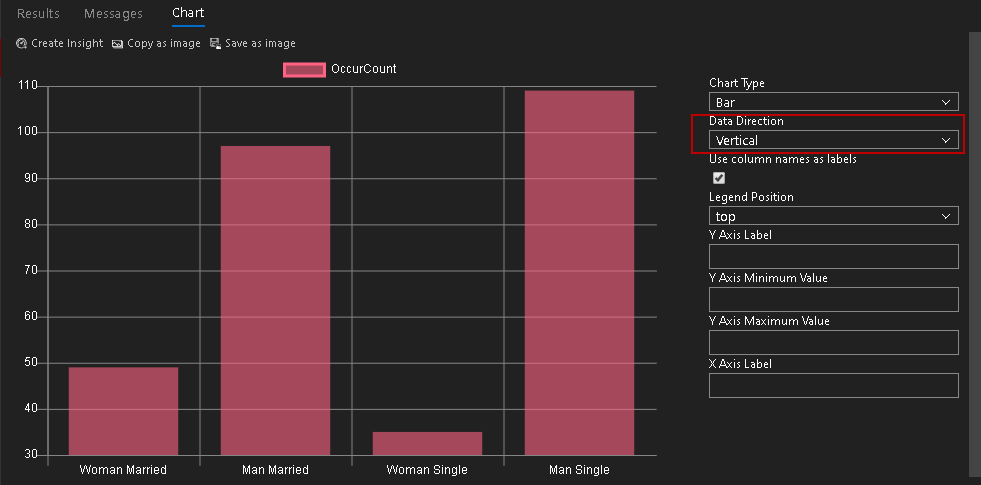
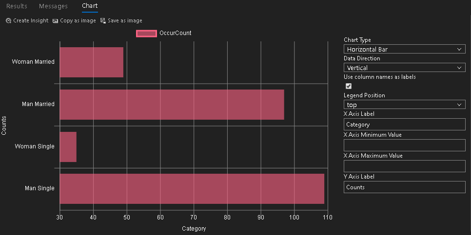
Data Direction: In this column, we can choose horizontal(default) or vertical data direction. In the above image, we do not get the correct bar chart because it shows all columns horizontally
数据方向:在此列中,我们可以选择水平(默认)或垂直数据方向。 在上图中,我们没有得到正确的条形图,因为它水平显示了所有列
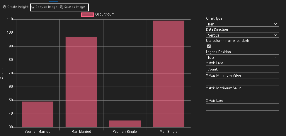
Let’s change it to Vertical data direction, and you get the following chart
让我们将其更改为“垂直数据”方向,您将得到以下图表
It automatically put a tick on the Use column names as labels. We can see that it shows employees’ data according to the [MaritalStatus] column.
它会自动在“ 使用列名称作为标签”上打勾。 我们可以看到它根据[MaritalStatus]列显示了员工的数据。
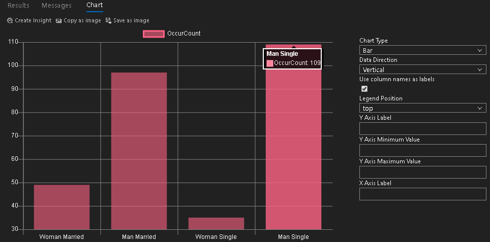
We can hover the mouse in the chart area to check the actual data points
我们可以将鼠标悬停在图表区域中以检查实际数据点
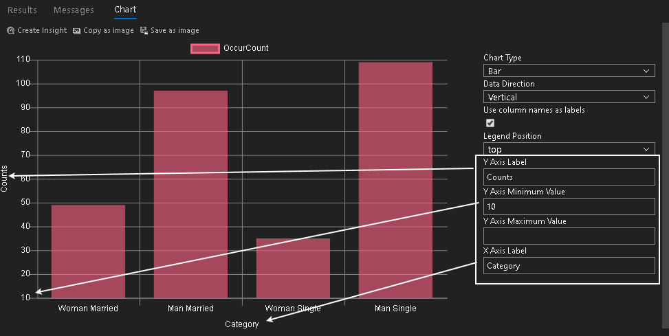
Apart from this, we can choose the labels for both the X and Y-axis. It also allows us to set minimum and maximum value for the axis. For example, in the above image, we can see it starts minimum value for the y-axis from 30. In the below screenshot, I change it to 10
除此之外,我们可以选择X轴和Y轴的标签。 它还允许我们设置轴的最小值和最大值。 例如,在上图中,我们可以看到它从30开始的y轴最小值。在下面的屏幕截图中,我将其更改为10
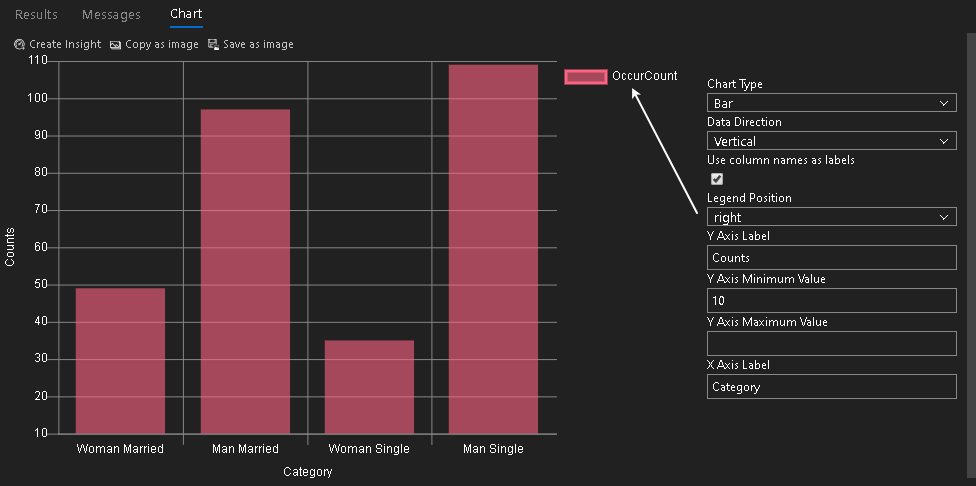
Legend position by default, chart shows legend at the top of the chart. We can change this position to bottom, left, right and none (disable). In the below image, we see the right legend position. In this position, it places the legend to the right side of the chart
图例位置默认情况下,图表在图的顶部显示图例。 我们可以将此位置更改为底部,左侧,右侧和无(禁用)。 在下图中,我们看到了正确的图例位置。 在此位置,将图例放在图表的右侧
We have similar configuration options in the horizontal chart type as well. You can note here that in the above image, we get configurations for x-axis minimum and maximum values while in the bar chart it gives Y-axis configurations
在水平图表类型中,我们也有类似的配置选项。 您可以在此处注意到,在上图中,我们获得了x轴最小值和最大值的配置,而在条形图中它给出了Y轴配置
You can also copy this chart or save it as an image using from the chart area
您也可以使用图表区域中的内容来复制此图表或将其另存为图像
Copy as image: It copies the Chart as an image in the clipboard. You can paste this image in other programs such as Microsoft Word, Excel, paint
复制为图像:它将图表复制为剪贴板中的图像。 您可以将此图像粘贴到其他程序中,例如Microsoft Word,Excel,绘画
Save as an image: Click on Save as image and specify a directory to save this image file
另存为图像:单击另存为图像并指定目录以保存该图像文件
折线图 (Line chart)
A line chart generates a plot or curve chart according to the data points. We can change the chart type from the default bar type to the line Chart, and it generates the following line chart for our result set.
折线图根据数据点生成曲线图或曲线图。 我们可以将图表类型从默认的条形更改为折线图,然后为结果集生成以下折线图。
Azure Data Studio中的饼图和甜甜圈图 (Pie and Doughnut chart in Azure Data Studio)
A Pie chart provides a circular statistical graphic. It divides the circle based on the data frequency. In our example, it divides the Chart as per the count of each category.
饼图提供圆形统计图形。 它根据数据频率划分圆。 在我们的示例中,它按每个类别的计数划分图表。
You can see different area size for each category. For example, we have the lowest count for women single, and it gets the lowest area in the pie chart.
您可以看到每个类别的不同区域大小。 例如,单身女性人数最低,饼图中面积最小。
We can quickly move to the Doughnut chart from a pie chart. It is also known as the Donut chart. It looks similar to a pie chart except it provides a round hole in the center. It got its name from Doughnut because it looks similar to a Doughnut.
我们可以从饼形图快速移至甜甜圈图。 它也被称为“ 甜甜圈图”。 它看起来类似于饼形图,但它在中心提供了一个圆Kong。 它的名字来自Donut,因为它看起来类似于Doughnut。
表格图 (Table chart)
In the table chart, we get the same in a tabular format, as shown below. It might look similar to a query out. The difference here is that you can create insight from this Chart. A chart insight is not in the scope of this article. I will cover it in a separate article. Meanwhile, you can go through a custom insight widget article on Microsoft docs.
在表格中,我们以表格形式获得了相同的内容,如下所示。 它可能看起来类似于查询。 此处的区别在于您可以从此图表中创建见解。 图表洞察力不在本文讨论范围之内。 我将在另一篇文章中介绍。 同时,您可以阅读有关Microsoft文档的自定义洞察小部件文章。
Azure Data Studio中的图像图表 (Image chart in Azure Data Studio)
It is a new chart type. Click on it, and you get following a big cross image because our result does not contain the binary form of an image.
这是一种新的图表类型。 单击它,您会得到一个较大的十字图像,因为我们的结果不包含图像的二进制形式。
It requires binary data for an image file to retrieve the image and show it in the Chart. SQL Server FILESTREAM and FILETABLE allow us to store the BLOB(Binary Large objects) in the file system with keepings its metadata into SQL tables. You can refer to FILESTREAM staircase on SQLShack.
它要求图像文件的二进制数据才能检索图像并将其显示在图表中。 SQL Server FILESTREAM和FILETABLE允许我们将BLOB(二进制大对象)存储在文件系统中,并将其元数据保存到SQL表中。 您可以参考SQLShack上的FILESTREAM楼梯。
In the following image, we get a high-level overview of SQL Server FILESTREAM.
在下图中,我们获得了SQL Server FILESTREAM的高级概述。
Let me outline the high-level steps in this article.
让我概述本文中的高级步骤。
You can go through the FILESTREAM articles and prepare a SQL table for it. I have the following binary data in the [DemoFileStreamTable].
您可以阅读FILESTREAM文章并为其准备一个SQL表。 我在[DemoFileStreamTable]中具有以下二进制数据。
结论 (Conclusion)
In this article, we explored that Azure Data Studio provides an integrated option for charts in the query results. We can create various charts without exporting data to Microsoft Excel or other client tools. I found it as a cool feature of ADS. You should explore it and be familiar with it.
在本文中,我们探讨了Azure Data Studio为查询结果中的图表提供了集成选项。 我们可以创建各种图表,而无需将数据导出到Microsoft Excel或其他客户端工具。 我发现它是ADS的一项很酷的功能。 您应该对其进行探索并熟悉它。
翻译自: https://www.sqlshack.com/create-charts-from-sql-server-data-using-azure-data-studio/
sql azure 语法
sql azure 语法 In this article, we will explore charts in an Azure Data Studio using data stored in SQL Server tables. 在本文中,我们将使用SQL Server表中存储的数据探索Azure Data Studio中的图表。 介绍 (Introduction) ...
创建并运行查询、存储过程、脚本等是数据库专业人员的核心任务。 本教程演示如何在 T-SQL 编辑器中创建数据库对象的主要功能。
您可以在本教學課程中,了解如何使用 Azure 数据 Studio 來完成下列工作:
搜索数据库对象
编辑表数据
使用代码段快速编写 T-SQL
使用查看数据库对象详细信息速览定义和转到定义
本教程需要安装 SQL...
因为本科毕设要用到云
数据库,华为云、阿里云都要收费,但是
Azure(新用户注册12个月免费?),所以采用了
Azure云
数据库。
且
Azure云连接
SQL Server十分方便,步骤如下:
1. 登录
Azure,在
Azure服务界面直接
创建SQL Server数据库
2.点击新建,开始
创建SQL Server数据库,在这里我的免费订阅超额了,用的学生订阅
3.然后就是依次填写资源组、服务器名称
azure 导入 bak
Azure Data Studio is a new GUI based tool that works on Windows, Mac OS and Linux operating systems. It connects to SQL Server, Azure database, and SQL DW.
Azure Data Studio是一个基于GUI...
在此快速入门中,您将使用Azure 数据 Studio连接到 Azure SQL 数据库服务器。 然后,将运行 TRANSACT-SQL (T-SQL) 语句来创建和查询中其他使用的 TutorialDB 数据库Azure 数据 Studio教程。
若要完成本快速入门教程,需要Azure 数据 Studio,和 Azure SQL 数据库服务器。...
sql azure 语法
This article explores the SQL Server Schema Compare extension in the Azure Data Studio.
本文探讨了Azure Data Studio中SQL Server架构比较扩展。
介绍 (Introduction)
We might have different...
ssms脚本生成缓慢
This article explores different ways to generate data scripts using Azure Data Studio and SQL Server Management
Studio.
本文探讨了使用Azure Data Studio和SQL Server Management Studio生成数据...
出口?当我们说出口时,我们究竟是什么意思?它可以像将数据导出到平面文件以便在Excel或其他东西中使用一样简单。它可能正在创建备份。也许我们的意思是创建一个bacpac文件。我们还可以考虑为数据库中的对象创建单独的脚本。最后,完全导出数据库对象定义怎么样?任何或所有这些都可能是问题所在。所以,让我们快速解决它们。
这些中的每一个都可以是手...
3. 在“设置”页面中,选择“语言”选项卡
4. 在“语言”选项卡中,选择“中文(简体)”或“中文(繁体)”作为首选语言
5. 关闭并重新打开
Azure Data Studio,以使更改生效
这样,您就可以在
Azure Data Studio中
使用中文了。

