科研作图中,坐标轴的字体、字号等参数有常用的选择,我常用的参数如下,坐标轴名称的字体是roman,字体需要加粗;坐标轴刻度的
字体是roman,字体需要斜体(italic),坐标轴名称和刻度的字号相同。
坐标轴名称通过
ax.set_xlabel
函数进行设置,典型的设置方法如下,ax.set_xlabel(“Distances / m”, font1)```,其中,第一个形式参数是坐标轴名称,第二个形式参数是名称的字体、字号等参数的设置。
坐标轴刻度的设置通过
ax.get_xticklabels()
、
ax.get_yticklabels()
进行设置,上述两个函数分别返回X轴和Y轴的坐标轴刻度,在Python的Matplotlib中被称为"tick label"。
示例程序如下,
import numpy as np
import matplotlib.pyplot as plt
import matplotlib.font_manager
def ReadFile(path, fileName):
print("Data File Path : {}".format(path))
print("File Name : {}".format(fileName))
f = open(path+fileName)
lines = f.readlines()
distances = []
for line in lines:
line = line.strip().split()
distances.append(float(line[0])*1000.)
distances = np.array(distances)
return distances
if __name__=='__main__':
print('hello')
for f in matplotlib.font_manager.fontManager.ttflist:
print(f.name)
path = '../step4-cylinderSegmentation-tiltedCamera/build/'
fileName = 'data_distances.txt'
distances = ReadFile(path, fileName)
hist, bin_edges = np.histogram(distances)
print(hist)
print(bin_edges)
binWidth = (bin_edges[1] - bin_edges[0])
bin_centers = bin_edges[:-1] + binWidth
label = str(round(distances.mean(),2)) + '$\pm$' + str(round(distances.std(),2)) + 'mm'
figsize = 8,6
figure, ax = plt.subplots(figsize=figsize)
ax.bar(bin_centers, hist, width=binWidth*0.8, label=label)
font1 = {'family': 'Nimbus Roman',
'weight': 'bold',
'style':'normal',
'size': 15,
font2 = {'family': 'Nimbus Roman',
'weight': 'normal',
'style':'italic',
'size': 16,
ax.set_xlabel("Distances / mm", font1)
ax.set_ylabel("Counts", font1)
plt.tick_params(labelsize=15)
labels = ax.get_xticklabels() + ax.get_yticklabels()
[label.set_fontname('Nimbus Roman') for label in labels]
[label.set_fontstyle('italic') for label in labels]
plt.title("Distribution of Distances from pionts in the cloud to Cylinder", fontsize=12)
plt.legend()
plt.tight_layout()
plt.savefig('figure_step4_distances.png')
plt.show()
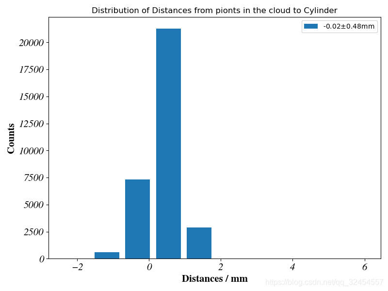
效果如图,
Matplotlib作图中坐标轴字体的加粗斜体格式背景介绍科研作图中,坐标轴的字体、字号等参数有常用的选择,我常用的参数如下,坐标轴名称的字体是roman,字体需要加粗;坐标轴刻度的字体是roman,字体需要斜体(italic),坐标轴名称和刻度的字号相同。实现方法坐标轴名称通过ax.set_xlabel函数进行设置,典型的设置方法如下,ax.set_xlabel(“Distances / m”, font1)```,其中,第一个形式参数是坐标轴名称,第二个形式参数是名称的字体、字号等参数的设置。
from pylab import *
from matplotlib.ticker import MultipleLocator, FormatStrFormatter
xmajorLocator = MultipleLocator(20) #将x主刻度标签设置为20的倍数
xmajorFormatter = FormatStrFormatter('%1.1f') #设置x轴标签文本的格式
xminorLocator = MultipleLocator(5) #将x轴次刻度标签设置为5的倍数
ymajorLocato
import matplotlib.dates as mdates
# 配置横坐标为日期格式
plt.gca().xaxis.set_major_formatter(mdates.DateFormatter('%Y/%m/%d'))
plt.gca().xaxis.set_major_locator(mdates.DayLocator())
from datetime import datetime
import matplotlib.dates as mdates
import matplot
# 修改标题及x,y坐标轴字体及大小
plt.title("$MFCC_0$参数中值滤波", fontsize=15,fontweight='bold')
plt.xlabel("时间/s", fontsize=15,fontweight='bold')
plt.ylabel("数值", fontsize=15,fontweight='bold')
# 修改坐标轴字体及大小
plt.yticks(fontproperties='Times New Roman', size=15)
plt.xticks(f
legend1=legend('FontName','Times New Roman',tmpName,'Interpreter', 'none','fontsize',fontSizeLegend,'Location','SouthEast');%可修改图例标注的位置,和字体,耶
title(titleName,'fontsize',fontSize,'FontName','Times New Roman');
xlabel(xL

