

箱线图绘制ggplot版!你想知道的都在这里

不带分组的差异箱型图
我们从最基本开始一点一点的进行,第一步,我们画一个基本的箱线图
首先让我们做一些准备工作,加载需要的包,选取内置数据集ToothGrowth
##加载包
library(ggplot2)
##加载数据
data("ToothGrowth")
ToothGrowth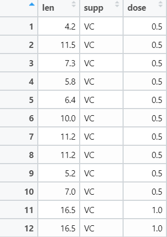
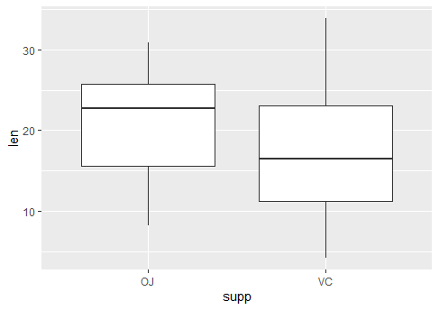
我们先来画一个最简单的箱线图,不做任何的美化,我们使用geom_boxplot绘图:
ggplot(ToothGrowth,aes(supp,len))+geom_boxplot()
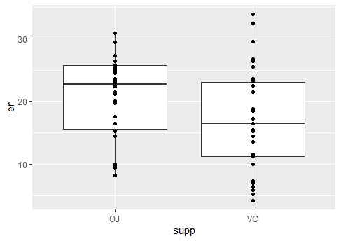
下一步,我们希望能够把每一个点都放在图中进行展示
ggplot(ToothGrowth,aes(supp,len))+geom_boxplot()+geom_point()
最好能够看出OJ组合VC组之间是否有差异,这个时候我们可以使用stat_compare_means()这个函数:
##重点介绍一下stat_compare_means这个函数
stat_compare_means(mapping = NULL,
                   comparisons = NULL,
                   hide.ns = FALSE,
                   label = NULL,
                   label.x = NULL,
                   label.y = NULL)
##对于参数的解释:
mapping: 由aes()创建的映射集合
comparisons: 一个长度为2的向量列表。向量中元素都是x轴的两个名字或者2个对于感兴趣,要进行比较的整数索引
hide.ns: 逻辑值,如果TRUE,隐藏不显著标记ns
label: 指定标签类型的字符串。允许值包括p.signif(显示显著性水平),p.format(显示p值)
label.x, label.y: 数值。用于摆放标签位置的坐标,如果太短,会循环重复。
…: 其他传入compare_means()的参数,例如:method、paired等
下面我们画一张带差异显著性的箱线图:
ggplot(ToothGrowth,aes(supp,len))+
geom_boxplot()+
geom_point()+
stat_compare_means(method = "t.test",
                   label = "p.format")
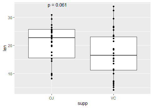
这里我们使用了p值,很多小伙伴很多会比较疑惑于这里的p值的计算,实际上stat_compare_means是引用了compare_means的假设检验结果,让我们先来看下compare_means的结果以及其参数的含义:
compare_means(len ~ supp, data = ToothGrowth)
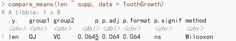
stat_compare_means的lables参数可以表征compare_means假设检验后的形式,可以是p.format,也可以是p.signif。默认的检验方法是Wilcoxon。
通常在文献中都是用p.signif,而且还要加一条横线,这个横线可以用到comparisons这个参数。
ggplot(ToothGrowth,aes(supp,len))+
geom_boxplot()+
geom_point()+
stat_compare_means(comparisons = list(c("OJ","VC")),
                   method = "t.test",
                   label = "p.signif")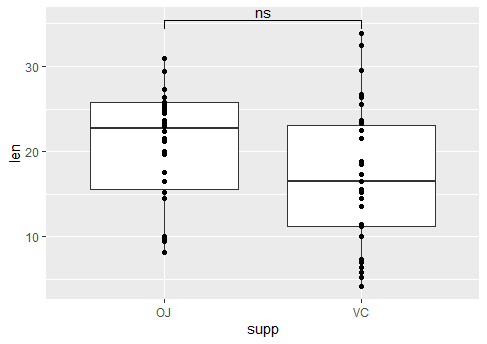

这个时候我们可以加一点颜色,把supp映射给color,当然我看还希望点是抖动的且没有超出箱线图的宽度:
ggplot(ToothGrowth,aes(supp,len,,color=supp))+
  geom_boxplot(width=0.5)+
  geom_point()+
  geom_jitter(width = 0.25)+
  stat_compare_means(comparisons = list(c("OJ","VC")),
      method = "t.test",label = "p.signif")
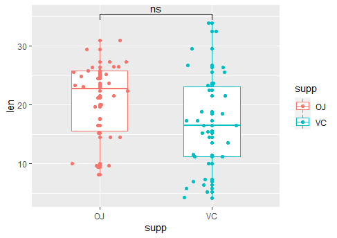
我们还希望这个箱线图的颜色按照我们预想中的来,自己来设定scale,同时改变主题:
ggplot(ToothGrowth,aes(supp,len,color=supp))+
  geom_boxplot(width=0.5)+
  geom_point()+
  geom_jitter(width = 0.25)+
  stat_compare_means(comparisons = list(c("OJ","VC")),
      method = "t.test",label = "p.signif")+
  scale_color_manual(values =c('#8BABD3','#D7B0B0'))+
  theme_bw() +
  theme(panel.background = element_blank(),
        panel.grid = element_blank(),  ##去掉背景网格
        axis.text.x = element_text(face="bold",angle = 45,hjust = 1,color = 'black'),
        axis.title.x = element_blank(),
        legend.position = "none",
        legend.direction = "vertical",
        legend.title =element_blank())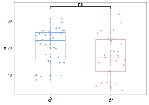

带分组的差异箱线图
数据集中的dose分为0.5,1和2,如果按照dose分组计算supp的差异我们应该怎么做呢?我们可以使用分面的方式来解决这样一个问题,当然这只是其中一种方法:
ggplot(ToothGrowth,aes(supp,len,color=supp))+
  geom_boxplot(width=0.5)+
  geom_point()+
  geom_jitter(width = 0.25)+
  facet_grid(~dose)+
  stat_compare_means(comparisons = list(c("OJ","VC")),
      method = "t.test",label = "p.signif")+
  scale_color_manual(values =c('#8BABD3','#D7B0B0'))+
  theme_bw() +
  theme(panel.background = element_blank(),
        panel.grid = element_blank(),  ##去掉背景网格
        axis.text.x = element_text(face="bold",angle = 45,hjust = 1,color = 'black'),
        axis.title.x = element_blank(),
        legend.position = "none",
        legend.direction = "vertical",
        legend.title =element_blank())
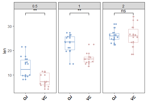
我们可以发现显著性signif的位置并不是那么的漂亮:
ggplot(ToothGrowth,aes(supp,len,color=supp))+
  geom_boxplot(width=0.5)+
  geom_point()+
  geom_jitter(width = 0.25)+
  facet_grid(~dose)+
  stat_compare_means(comparisons = list(c("OJ","VC")),
      method = "t.test",label = "p.signif",
      label.y =35 )+   ##label.y:signif标注的位置(y方向的)
  ylim(c(0,40))+  ##y轴的范围
  scale_color_manual(values =c('#8BABD3','#D7B0B0'))+
  theme_bw() +
  theme(panel.background = element_blank(),
        panel.grid = element_blank(),  ##去掉背景网格
        axis.text.x = element_text(face="bold",angle = 45,hjust = 1,color = 'black'),
        axis.title.x = element_blank(),
        legend.position = "none",
        legend.direction = "vertical",
        legend.title =element_blank())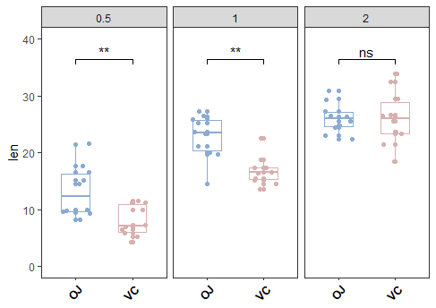

分组配对箱线图
很多人会推荐使用ggpaired,两种方法我都试验了一下,ggpaired更便捷,但是不利于个性化的修改,直接用ggplot+geom_boxplot+geom_point+geom_line可以根据自己的喜好进行改动。注意这里因为需要配对做连线,所以我们就省去了geom_jitter不再做点的抖动了。
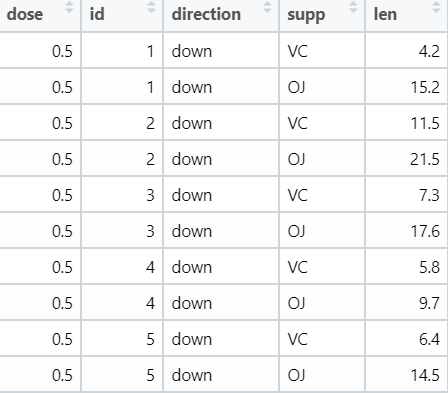
这个时候我们最好把数据添加上标签,以便于一一对应做配对:
ToothGrowth=ToothGrowth %>% mutate(id=c(rep(1:30,2)))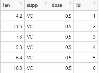
绘图代码如下:
ggplot(ToothGrowth,aes(supp,len))+
  geom_boxplot(aes(color=supp),width=0.5)+
  geom_point(aes(color=supp),alpha=0.7)+
  geom_line(aes(group=id),size=0.4,linetype=1,color="grey")+
  facet_grid(~dose)+
  stat_compare_means(comparisons = list(c("OJ","VC")),
      method = "t.test",label = "p.signif",
      paired = T,  ##配对t检验
      label.y =35 )+
  ylim(c(0,40))+
  scale_color_manual(values =c('#8BABD3','#D7B0B0'))+
  theme_bw() +
  theme(panel.background = element_blank(),
        panel.grid = element_blank(),  ##去掉背景网格
        axis.text.x = element_text(face="bold",angle = 45,hjust = 1,color = 'black'),
        axis.title.x = element_blank(),
        legend.position = "none",
        legend.direction = "vertical",
        legend.title =element_blank())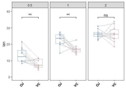

我们还希望能够把连线的上调和下调进行区分:
这样的话我们最好做一次长变宽,用direction的up或者down来进行区分
ToothGrowth=ToothGrowth %>% pivot_wider(names_from = supp,values_from = len)%>%
  mutate(direction=VC-OJ) %>%
  mutate(direction=ifelse(direction<0,"down","up")) %>%
  pivot_longer(-c(1:2,5),names_to = "supp",values_to = "len")
绘图代码:
ggplot(ToothGrowth,aes(supp,len))+
  geom_boxplot(aes(color=supp),width=0.5)+
  geom_point(aes(color=supp),alpha=0.7)+
  geom_line(aes(group=id,color=direction),size=0.4,linetype=1)+
  facet_grid(~dose)+
  stat_compare_means(comparisons = list(c("OJ","VC")),
      method = "t.test",label = "p.signif",
      paired = T,
      label.y =35 )+
  ylim(c(0,40))+
  scale_color_manual(values =c('#8BABD3','#D7B0B0','#E64B35FF','#4DBBD5FF'))+
  theme_bw() +
  theme(panel.background = element_blank(),